1、准备好需要用到的图标。


2、新建html文档。

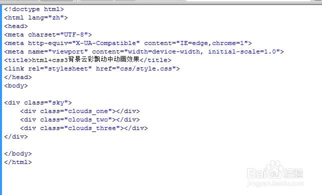
3、书写hmtl代码。
<div class="sky">
<div class="clouds_one"></div>
<div class="clouds_two"></div>
<div class="clouds_three"></div>
</div>

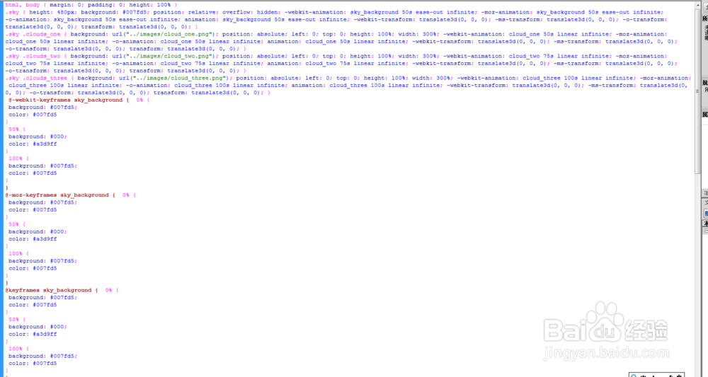
4、书写css代码。
html, body { margin: 0; padding: 0; height: 100% }
.sky { height: 480px; background: #007fd5; position: relative; overflow: hidden; -webkit-animation: sky_background 50s ease-out infinite; -moz-animation: sky_background 50s ease-out infinite; -o-animation: sky_background 50s ease-out infinite; animation: sky_background 50s ease-out infinite; -webkit-transform: translate3d(0, 0, 0); -ms-transform: translate3d(0, 0, 0); -o-transform: translate3d(0, 0, 0); transform: translate3d(0, 0, 0); }
.sky .clouds_one { background: url("../images/cloud_one.png"); position: absolute; left: 0; top: 0; height: 100%; width: 300%; -webkit-animation: cloud_one 50s linear infinite; -moz-animation: cloud_one 50s linear infinite; -o-animation: cloud_one 50s linear infinite; animation: cloud_one 50s linear infinite; -webkit-transform: translate3d(0, 0, 0); -ms-transform: translate3d(0, 0, 0); -o-transform: translate3d(0, 0, 0); transform: translate3d(0, 0, 0); }
.sky .clouds_two { background: url("../images/cloud_two.png"); position: absolute; left: 0; top: 0; height: 100%; width: 300%; -webkit-animation: cloud_two 75s linear infinite; -moz-animation: cloud_two 75s linear infinite; -o-animation: cloud_two 75s linear infinite; animation: cloud_two 75s linear infinite; -webkit-transform: translate3d(0, 0, 0); -ms-transform: translate3d(0, 0, 0); -o-transform: translate3d(0, 0, 0); transform: translate3d(0, 0, 0); }
.sky .clouds_three { background: url("../images/cloud_three.png"); position: absolute; left: 0; top: 0; height: 100%; width: 300%; -webkit-animation: cloud_three 100s linear infinite; -moz-animation: cloud_three 100s linear infinite; -o-animation: cloud_three 100s linear infinite; animation: cloud_three 100s linear infinite; -webkit-transform: translate3d(0, 0, 0); -ms-transform: translate3d(0, 0, 0); -o-transform: translate3d(0, 0, 0); transform: translate3d(0, 0, 0); }
@-webkit-keyframes sky_background { 0% {
background: #007fd5;
color: #007fd5
}
50% {
background: #000;
color: #a3d9ff
}
100% {
background: #007fd5;
color: #007fd5
}
}
@-moz-keyframes sky_background { 0% {
background: #007fd5;
color: #007fd5
}
50% {
background: #000;
color: #a3d9ff
}
100% {
background: #007fd5;
color: #007fd5
}
}
@keyframes sky_background { 0% {
background: #007fd5;
color: #007fd5
}
50% {
background: #000;
color: #a3d9ff
}
100% {
background: #007fd5;
color: #007fd5
}
}
@-webkit-keyframes cloud_one { 0% {
left: 0
}
100% {
left: -200%
}
}
@-moz-keyframes cloud_one { 0% {
left: 0
}
100% {
left: -200%
}
}
@keyframes cloud_one { 0% {
left: 0
}
100% {
left: -200%
}
}
@-webkit-keyframes cloud_two { 0% {
left: 0
}
100% {
left: -200%
}
}
@-moz-keyframes cloud_two { 0% {
left: 0
}
100% {
left: -200%
}
}
@keyframes cloud_two { 0% {
left: 0
}
100% {
left: -200%
}
}
@-webkit-keyframes cloud_three { 0% {
left: 0
}
100% {
left: -200%
}
}
@-moz-keyframes cloud_three { 0% {
left: 0
}
100% {
left: -200%
}
}
@keyframes cloud_three { 0% {
left: 0
}
100% {
left: -200%
}
}
5、代码整体结构。
6、查看效果。