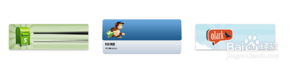
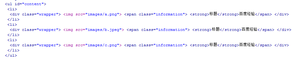
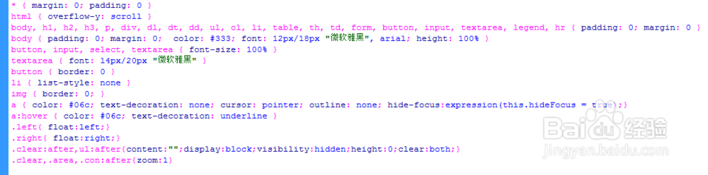
1、准备好需要用到的图。


2、新建html文档。

3、书写hmtl代码。
<ul id="content">
<li>
<div class="wrapper"> <img src="images/a.png"> <span class="information"> <strong>标题</strong>百度经验</span> </div>
</li>
<li>
<div class="wrapper"> <img src="images/b.jpeg"> <span class="information"> <strong>标题</strong>百度经验</span> </div>
</li>
<li>
<div class="wrapper"> <img src="images/c.png"> <span class="information"> <strong>标题</strong>百度经验</span> </div>
</li>
</ul>
4、初始化css代码。
<style>
* { margin: 0; padding: 0 }
html { overflow-y: scroll }
body, h1, h2, h3, p, div, dl, dt, dd, ul, ol, li, table, th, td, form, button, input, textarea, legend, hr { padding: 0; margin: 0 }
body { padding: 0; margin: 0; color: #333; font: 12px/18px "微软雅黑", arial; height: 100% }
button, input, select, textarea { font-size: 100% }
textarea { font: 14px/20px "微软雅黑" }
button { border: 0 }
li { list-style: none }
img { border: 0; }
a { color: #06c; text-decoration: none; cursor: pointer; outline: none; hide-focus:expression(this.hideFocus = true);}
a:hover { color: #06c; text-decoration: underline }
.left{ float:left;}
.right{ float:right;}
.clear:after,ul:after{content:"";display:block;visibility:hidden;height:0;clear:both;}
.clear,.area,.con:after{zoom:1}
</style>
5、书写css代码。
初始化css代码。
<style>
* { margin: 0; padding: 0 }
html { overflow-y: scroll }
body, h1, h2, h3, p, div, dl, dt, dd, ul, ol, li, table, th, td, form, button, input, textarea, legend, hr { padding: 0; margin: 0 }
body { padding: 0; margin: 0; color: #333; font: 12px/18px "微软雅黑", arial; height: 100% }
button, input, select, textarea { font-size: 100% }
textarea { font: 14px/20px "微软雅黑" }
button { border: 0 }
li { list-style: none }
img { border: 0; }
a { color: #06c; text-decoration: none; cursor: pointer; outline: none; hide-focus:expression(this.hideFocus = true);}
a:hover { color: #06c; text-decoration: underline }
.left{ float:left;}
.right{ float:right;}
.clear:after,ul:after{content:"";display:block;visibility:hidden;height:0;clear:both;}
.clear,.area,.con:after{zoom:1}
</style>

6、代码整体结构。

7、查看效果。